
Our Reporting Standards
Public verification and scoring for threat assessments and Citizen Harms. No rumor. No spin.
Our mission
We track how policy decisions become national security threats and household harm, so citizens can see what is coming, who benefits, and whether public safety is being traded for private gain.
We do this with documented sourcing, clear verification labels, and pattern tracking that helps readers recognize escalation while protective options still exist.
Jump To:
🔓Start Here: How to Read a Briefing (2 minutes)
💡Verification Labels: Verified, Watchlist, Rejected
🚨How Severity Scoring Works
🔎Glossary of Terms
🙋🏻♀️About the Analysts
How to use this page
➠ New reader: read How to Read a Briefing first.
➠ Skeptic or journalist: check Verification Labels and Severity Scoring to see how we separate confirmed facts from items we are monitoring.
➠ Returning reader: Use the Glossary when a term is unfamiliar.
🔓 How to read this model
This model does not predict specific events. It explains how risk conditions get built before they become visible.
Most public coverage begins after damage is already apparent. Our reporting focuses earlier, when weak signals begin to stress that can later translate into real household harm.
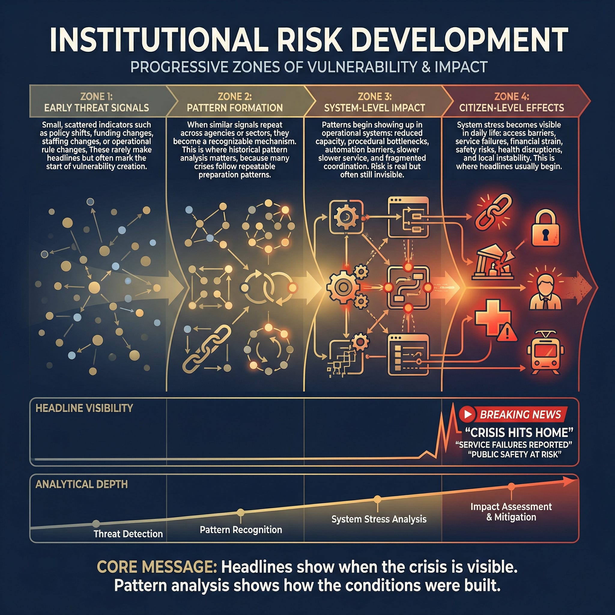
Zone 1: Early threat signals
Small, scattered indicators such as policy shifts, funding changes, staffing changes, or operational rule changes. These rarely make headlines but often mark the start of vulnerability creation.
Zone 2: Pattern formation
When similar signals repeat across agencies or sectors, they become a recognizable mechanism. This is where historical pattern analysis matters because many crises follow repeatable preparation paths.
Zone 3: System-level impact
Patterns begin showing up in operational systems: reduced capacity, procedural bottlenecks, automation barriers, slower service, and fragmented coordination. Risk is real but often still invisible to the public.
Zone 4: Citizen-level effects
System stress becomes visible in daily life: access barriers, service failures, financial strain, safety risks, health disruptions, and local instability. This is where headlines usually begin.
Headline visibility vs analytical depth
Headlines usually arrive late, when impacts are already tangible. Earlier analysis focuses on clustering signals, connecting patterns, and tracking how risk can spread across systems.
Core idea: Headlines show when the crisis is visible. Pattern analysis shows how the conditions were built.
How Barking Justice Media uses this model
We start on the left side of the diagram, where risk is still quiet, and most people are not paying attention.
Our process is simple:
Collect signals that indicate capacity loss, rule changes, funding shifts, enforcement changes, or new institutional capabilities.
Verify before we claim. We anchor major claims to primary public documents when available (court filings, agency notices, budgets, procurement records and, official statements). When primary documents are unavailable, we require multiple high-quality independent sources and active checks to disconfirm.
Track patterns, not noise. When signals recur across contexts, we treat them as a developing mechanism rather than a one-off event.
Translate into public language. We explain what changed, how it spreads, and what it can do to households and local systems.
Publish watch triggers. We specify observable markers that would confirm escalation or spread, so readers can distinguish real movement from panic.
Headlines are not the enemy. The problem is timing and framing. Headlines often capture the moment of visible damage, while readers still need the underlying mechanics: what changed earlier, how it traveled through institutions, and where the next escalation is likely to appear.
We focus on household-level effects because they are where institutional stress becomes real: delayed care, denied benefits, administrative lockouts, rising costs, weakened protections, and sudden rule changes that affect families’ outcomes.
Harms do not land evenly. People with less buffer get hit first and hardest: less savings, less time to navigate bureaucracy, less flexibility to miss work, and fewer alternatives when systems fail.
When systems become harder to navigate or less accountable, wealth transfer can follow. Complexity and friction can shift burdens onto households through delays, denials, fees, outsourcing, and reduced oversight. Sometimes this is intentional. Often, it is a predictable result of stripping capacity and removing constraints.
Our thesis is practical: when you can see a pattern early, you can document it, name it, pressure the right decision points, and act inside the action window before harm becomes widespread.
💡 Verification labels: Verified, Watchlist, Rejected
We separate what is confirmed from what is being monitored so readers can tell the difference at a glance.
Verified
A claim is Verified when it is anchored to:
Primary public documents, or
Multiple high-quality independent sources, plus disconfirming checks
Watchlist
A Watchlist item is a credible early signal that is not yet fully supported by primary documentation. We publish Watchlist items so readers can monitor and prepare, but we do not ask readers to share them as fact.
Rejected
A claim is Rejected when it fails verification, conflicts with documentation, or appears to be rumor, manipulation, or misattribution.
Illustrative example: how a pattern can escalate (illustrative only)
This is a simplified example of how an institutional capability can move from early signals to household harm.
What changed: A large coverage system expands automated prior-approval rules for certain services.
Early signals: policy updates, vendor contracts, workflow changes, appeals backlog indicators.
Pattern formation: similar automation and denial behavior appears across adjacent benefits.
System impact: longer processing times, higher documentation burden, and appeals delays.
Citizen-level effects: delayed care, surprise costs, and benefit access failures.
🚨How Severity Scoring Works
(Understanding how Barking Justice Media tracks patterns and scores risk)
Our Scoring Framework
This page explains the language, labels, and scorecards you see in our briefings so you can read them quickly and confidently. It is designed to help you understand our work, not replicate our internal framework.
Nothing on this page is legal or medical advice. We publish public-interest analysis to support informed decision-making, documentation, and protective action planning.
What we mean by “threat”
In our reporting, a “threat” is not a rumor or a prediction about any specific person’s intent.
A threat is a repeatable institutional capability that can produce household harm when it is activated, scaled, or normalized. We track what changes in the real world, how it can spread, and how quickly it can reach ordinary people.
How to read a briefing in 60 seconds
Most posts are built to answer five questions, in order:
· What changed: The concrete action, decision, filing, funding move, or operational shift.
· Why it matters: The likely effects on safety, rights, access, or economic security.
· What pattern does this fit: Whether the event is a one-off or part of a repeatable playbook.
· What to watch next: Observable watch triggers that confirm escalation or spread.
· What you can do now: A fast counter-move and, for paid members, the full protection protocol.
How to read the scorecards
Severity score (0 to 100)
Velocity (0 to 10)
Trajectory (0 to 10)
Reversibility (0 to 10)
Enabler (0 to 10)
Impact (0 to 10)
What the gauges mean in plain language
· Severity score is the headline risk level. It is the combined view, not a single factor.
· The five drivers tell you why the severity is high or low.
Why we score this way
Scoring lets you compare very different threats on a common scale. It also makes our reasoning legible. You can disagree with our conclusions and still see how we arrived at them.
Severity bands
80 to 100: Critical
60 to 79: High
40 to 59: Medium
20 to 39: Low
How to use the score
· High velocity means acting sooner because the window closes fast.
· High reversibility means act sooner because damage is hard to undo.
· High enabler means this is a reusable tool that can spread across domains.
· High impact means more households can be affected, or harms are more severe.
· High trajectory means acceleration, expansion, and compounding risk.
We publish enough scoring detail for transparency and reader understanding, but we do not publish the full internal calibration rules.
🔎Glossary
Threat pattern: A repeatable tactic or capability used across multiple situations.
Pattern status: Forming, Established, Escalating, Declining.
Threat level: Monitor, Elevated, Severe.
Watch triggers: Specific observable events that confirm a direction.
15-minute counter-move: One fast action that improves readiness or reduces exposure.
Full protection protocol: A deeper action set provided to paid members for major threats.
🙋🏻♀️ About the analysts
Mika Douglas
Founder and lead investigative journalist.
I’m Mika Douglas, founder of Barking Justice Media. I publish threat assessments and pattern-based reporting on how institutional decisions, funding structures, and procedural complexity translate into real-world harm for households.
My work is built for early warning, not hot takes. I track repeatable mechanisms: how rules get rewritten quietly, how budgets steer outcomes, how contracts and “pilot programs” change access, and how administrative friction shifts time, money, and rights onto the public.
My career spans executive leadership in U.S. software and international roles in Asia, including senior operations and strategy work in Bangkok. That global perspective matters because domestic risks are often shaped by global capital, supply chains, technology platforms, and foreign influence pathways.
My approach blends journalism and strategic analysis:
Verification first
Pattern tracking: timelines, incentive maps, and “what to watch next”
Plain language: clear storylines and practical action paths
I am also the author of a nonfiction book on policy design and institutional burden shifting, written to help readers recognize the difference between stated intent and operational reality.
Robert Anderson
Co-founder, co-author, and analyst.
Robert Anderson is a co-founder of Barking Justice Media and supports the work as a co-author and analyst. His background includes intelligence and risk analysis across complex operational environments, with a disciplined approach to assessing fast-moving risks and communicating them clearly for real-world decisions.
In California, Robert worked with the Governor’s Office of Service and Volunteerism and with the California Health and Human Services Agency, gaining direct experience with government procurement, program delivery, and the constraints that shape what agencies can implement.
While in Asia, he worked in university education in cultural studies, strengthening his ability to interpret institutional communication, narrative shifts, and cross-cultural context.
At Barking Justice Media, Robert applies this combined operational and cultural expertise to public-risk reporting: explaining what has changed, how it moves through institutions, and what readers can do while protective options remain available.
Corrections and updates
If we publish an error, we correct it clearly and note what changed. If you have documentation that improves accuracy, contact us.
Barking Justice Media LLC is an independent journalism organization. Our reporting is grounded in document-based verification and threat pattern recognition, focused on how policy decisions can create national security risk and household harm. This publication is for informational purposes only and does not constitute legal, medical, financial, or other professional advice.
 | A guest post by
|
 | A guest post by
|